Thursday, March 22, 2018
Grid "Event" Practice
Makin' up events to advertise with more grid practice.
Man, I wish we could have an event like this in town.
Tuesday, March 20, 2018
The Oscars Showed Us Why Typography Matters
It is incredibly obvious now why a mistake was made during the Oscars.
Before now, I never quite understood how this kind of mistake could be made. I had originally assumed that the cards just had the name of the winner on it and nothing else. Once I heard it was a slight error on the part of the one handing out the cards, I kind of understood. However, now that I see the actual design of the card, I want to find who designed them and ask them how anyone is supposed to read the practically microscopic text at the bottom that tells you what category the name applies to. No wonder the reader had an issue onstage. The category label essentially disappears at the bottom while the name above dominates the center of the card. What makes it worse is that they prioritized the Oscars logo at the top over the word that tells you the correct category.
With a mess-up like this, it's kind of clear how it happened. Now, the question remaining is whether or not they"ll learn from their mistakes and change the layout of the card entirely.
InDesign Grid Practice
Monday, March 19, 2018
Zine Cover Sketches
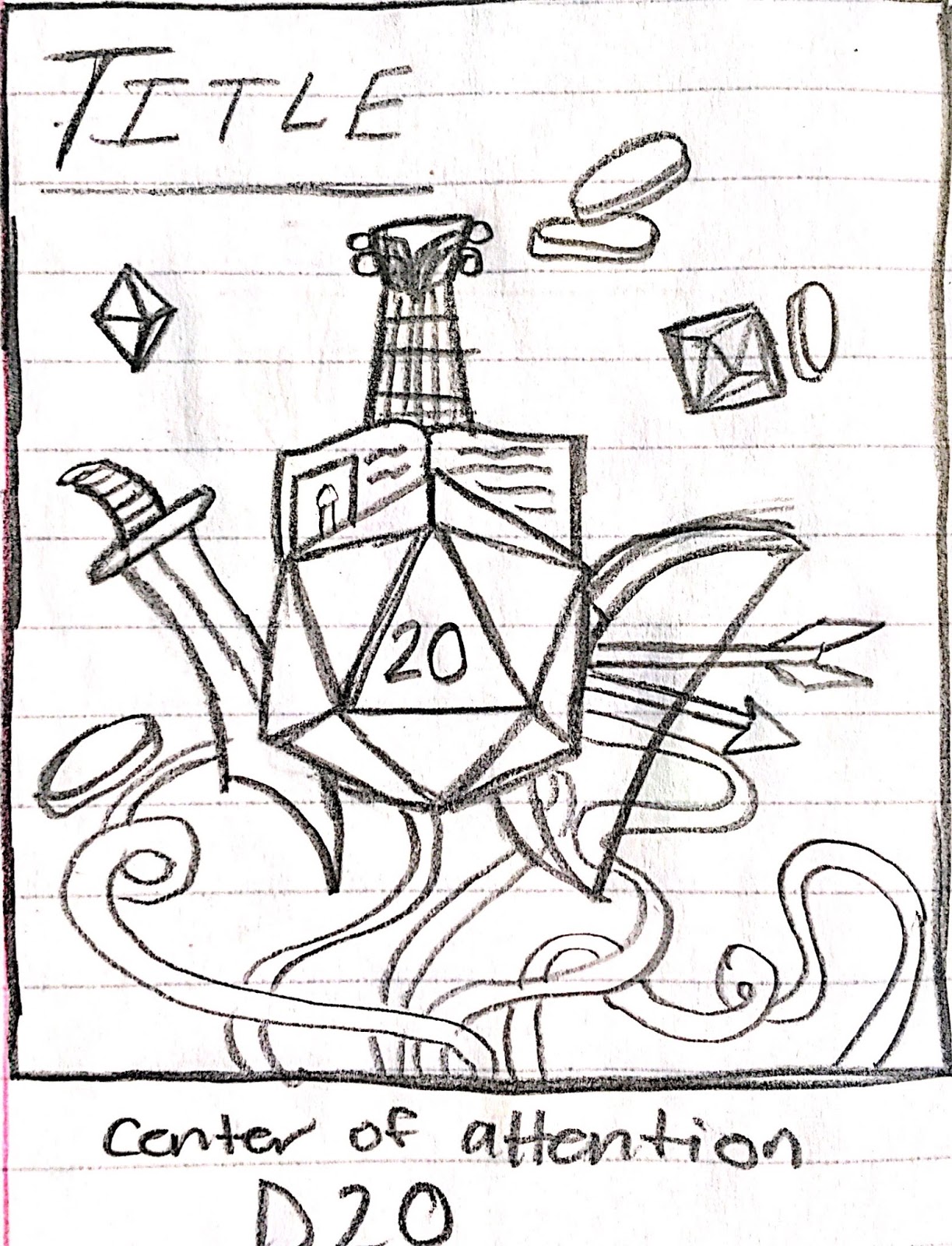
Three possible sketches for my Zine cover. Dungeons and Dragons theme for the content because I'm a huge nerd.
Tuesday, March 13, 2018
InDesign Practice
Messing with InDesign is rather fun. What's also fun is making up dialogue from two characters who technically don't exist yet.
Tuesday, February 20, 2018
Illustrator-Color Practice with Patterns
More illustrator practice. This time utilizing the Color Guides tab and focusing on which colors work well together and which ones don't.
Makes for an interesting time when playing with color and trying not to get a headache on accident because I keep staring at white for a few hours.
Thursday, February 15, 2018
Illustrator- Letter Construction
More Adobe Illustrator practice. We were building letters out of basic shapes provided by the shape tool. It was a little difficult to try and decide how to structure these, since making an R typically means using multiple shapes instead of just one. It was interesting to step out of the comfort zone for this.
Subscribe to:
Posts (Atom)